

Creative Presentation Ideas and Design Tips: Transform Your Slides from Boring to Brilliant

Ready to ditch those snooze-worthy slideshows? Let’s dive into the world of creative presentations where design meets storytelling, and your audience actually stays awake!
Picture this: you’re sitting in yet another meeting, watching someone drone on with slide after slide of bullet points and clipart from 2003. Sound familiar? We’ve all been there—both as the tortured audience and, let’s be honest, probably as the presenter too. But here’s the thing: presentations don’t have to be the corporate equivalent of watching paint dry.

Whether you’re pitching to potential investors, training your team, or presenting research findings, the difference between a forgettable presentation and one that leaves a lasting impact often comes down to creativity and smart design choices. In today’s attention-deficit world, you’ve got about 30 seconds to hook your audience before they start mentally planning their grocery list.
That’s where creative presentation ideas and design tips come into play. They’re not just about making things look pretty—though that certainly doesn’t hurt. They’re about creating an experience that resonates, informs, and inspires action. Let’s explore how to transform your next presentation from mundane to magnificent.
The Psychology Behind Engaging Presentations
Before we jump into the nitty-gritty of design elements, let’s talk about what makes presentations stick. According to research from the Harvard Business Review, our brains are wired to process visual information 60,000 times faster than text. That’s not just a fun fact—it’s your secret weapon.
When you understand that people retain 65% of visual information three days later compared to only 10% of text-based information, suddenly those creative presentation ideas don’t seem like nice-to-haves anymore. They become essential tools for effective communication. The key is leveraging this psychological reality to your advantage.
Moreover, emotional engagement plays a crucial role in information retention. Studies from Stanford’s Graduate School of Business show that stories are up to 22 times more memorable than facts alone. This means your presentation needs to tell a story, not just relay information.
Visual Storytelling: The Foundation of Creative Presentations
Here’s where things get interesting. Visual storytelling isn’t just about slapping some images on your slides and calling it a day. It’s about creating a narrative arc that guides your audience through your content like a well-crafted movie.
Start with the classic three-act structure: setup, conflict, and resolution. Your opening should establish context and hook your audience. Maybe it’s a surprising statistic, a thought-provoking question, or a relatable scenario. Then, present the challenge or problem your audience faces—this is your conflict. Finally, offer your solution or key insights as the resolution.
The beauty of this approach? It transforms passive listeners into active participants in your story. They’re not just receiving information; they’re experiencing it. Consider using visual metaphors that resonate with your audience’s experience. If you’re presenting to marketing teams, use journey maps. For finance folks, think in terms of growth trajectories and investment returns.
Design Principles That Make Presentations Pop
Now, let’s talk design—and no, you don’t need to be the next Picasso to create visually stunning slides. Good design follows principles that anyone can master with a bit of practice and the right creative presentation ideas.
The Rule of Three: Your audience can comfortably process three main points at a time. More than that, and you’re asking for cognitive overload. Structure your presentation around three key messages, use three supporting points for each section, and when in doubt, group information in threes.
White Space is Your Friend: Cramming everything onto one slide is like trying to have a conversation in a crowded nightclub—technically possible, but nobody’s going to enjoy it. White space gives your content room to breathe and helps direct attention to what matters most. It’s not empty space; it’s strategic space.
Typography Matters More Than You Think: Your font choices speak volumes about your professionalism and attention to detail. Stick to 2-3 fonts maximum: one for headlines, one for body text, and perhaps one for accents. Sans-serif fonts like Helvetica or Montserrat work great for presentations because they’re clean and readable from a distance.
Color Psychology in Action: Different colors evoke different emotions and associations. Blue conveys trust and professionalism (hello, corporate world), while red creates urgency and excitement. Green suggests growth and harmony, perfect for sustainability topics. But here’s the kicker—cultural context matters. What works in New York might not resonate in Tokyo.
Interactive Elements That Keep Audiences Engaged
Let’s face it: sitting through a one-way information dump is about as exciting as watching grass grow. Interactive elements are your secret weapon for maintaining engagement and creating memorable experiences.
Polls and Q&A Sessions: Real-time polling tools like Mentimeter or Slido can transform your presentation into a conversation. Ask provocative questions, gather opinions, or test knowledge retention. The key is timing—strategically placed polls can re-energize a room that’s starting to zone out.
Gamification Elements: Who says presentations can’t be fun? Introduce quiz elements, challenges, or even friendly competitions. Create a points system for participation, or use tools like Kahoot for interactive quizzes. Just remember: the game should enhance your message, not overshadow it.
Breakout Activities: For longer presentations, consider incorporating brief breakout sessions where small groups discuss key concepts. This approach works particularly well for training sessions or workshops. It gives people a chance to process information and apply it immediately.
Technology Integration for Modern Presentations
We’re living in the future, folks, and your presentations should reflect that. Technology integration isn’t about showing off—it’s about enhancing your message and creating more impactful experiences.
Augmented Reality (AR) and Virtual Reality (VR): These aren’t just buzzwords anymore. AR can overlay digital information onto physical spaces, perfect for architectural presentations or product demos. VR can transport your audience to different locations or scenarios. Companies like Prezi now offer AR presentation features that work with smartphones.
Motion Graphics and Animation: Static slides are so last decade. Subtle animations can guide attention, reveal information progressively, and add visual interest. Tools like Lottie offer free animations that can elevate your slides without requiring animation skills.
Live Data Integration: Why show yesterday’s numbers when you can display real-time data? Tools like Tableau or Google Data Studio can pull live data directly into your presentations. This is particularly powerful for sales presentations or performance reviews.
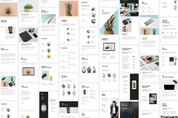
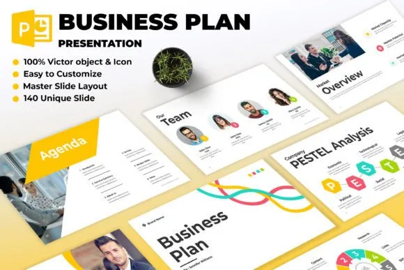
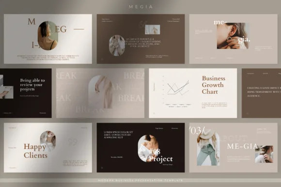
Templates and Tools for Quick Implementation
Not everyone has hours to spend crafting the perfect presentation from scratch. That’s where smart templates and tools come in handy. But here’s the thing—templates are starting points, not endpoints.
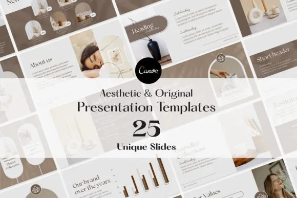
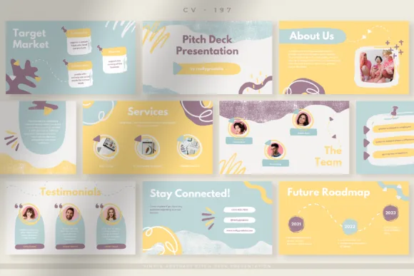
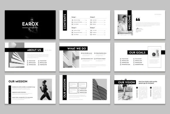
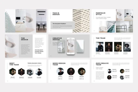
Beyond PowerPoint: While PowerPoint remains the presentation workhorse, alternatives like Canva, Beautiful.ai, or Pitch offer more design-forward approaches. These platforms often include AI-powered design suggestions and built-in brand consistency features.
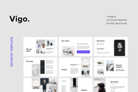
Template Customization: The best templates are those you can make your own. Look for options that allow color scheme changes, font substitutions, and layout modifications. Your goal is to maintain visual consistency while reflecting your unique brand or message.
Remember, the tool doesn’t make the presenter—but the right tool can certainly make your job easier. Choose platforms that align with your technical comfort level and presentation requirements.
Avoiding Common Design Mistakes
Even with the best intentions, it’s easy to fall into design traps that can derail your presentation. Let’s talk about the most common mistakes and how to avoid them.
The Bullet Point Trap: Bullet points aren’t inherently evil, but they’ve become the default for lazy presentation design. Instead of listing everything, try using visual hierarchies, flowcharts, or infographics to present information. Your audience will thank you for the variety.
Information Overload: Just because you can fit 500 words on a slide doesn’t mean you should. Each slide should focus on one key concept. If you need more space, use multiple slides or provide detailed information in handouts.
Inconsistent Design Elements: Mixing fonts, colors, and styles randomly makes your presentation look unprofessional. Establish a visual style guide at the beginning and stick to it throughout. This includes consistent spacing, alignment, and color usage.
Ignoring Your Audience: The fanciest design in the world won’t work if it doesn’t resonate with your audience. Consider their technical background, cultural context, and expectations. A presentation for kindergarten teachers should look different from one for aerospace engineers.
Measuring Presentation Success
How do you know if your creative presentation ideas and design tips are actually working? Success metrics go beyond just “people stayed awake”—though that’s certainly a good start.
Engagement Metrics: Track participation rates in polls, Q&A sessions, and interactive elements. High engagement usually correlates with better information retention and positive audience response.
Feedback Collection: Don’t just ask, “Any questions?” at the end. Use structured feedback forms that ask specific questions about content clarity, visual appeal, and actionable insights. Tools like SurveyMonkey or Typeform make this easy.
Follow-up Actions: The best presentations inspire action. Track whether your audience follows through on your call-to-action items. This could be anything from signing up for a newsletter to implementing new processes.
Frequently Asked Questions
Q: How many slides should I include in my presentation? A: There’s no magic number, but a good rule of thumb is roughly one slide per minute of presentation time. Quality trumps quantity every time—better to have 10 compelling slides than 30 forgettable ones.
Q: What’s the best way to handle technical difficulties during a presentation? A: Always have a backup plan. Keep a PDF version of your slides, test all technology beforehand, and have a low-tech alternative ready. Most importantly, stay calm and use humor when appropriate—your audience will appreciate your professionalism.
Q: Should I provide handouts during or after my presentation? A: Generally, it’s better to provide detailed handouts after your presentation to avoid distracting your audience. However, if you need them to follow along with complex processes or take notes, distribute them beforehand.
Q: How do I adapt my presentation for virtual audiences? A: Virtual presentations require more frequent interaction and visual variety. Use polls, breakout rooms, and chat features actively. Keep slides simpler and text larger since people are viewing on smaller screens.
Q: What’s the biggest mistake first-time presenters make? A: Trying to cover too much ground. It’s better to thoroughly explore three key points than to superficially touch on ten. Your audience will remember depth over breadth.
Wrapping It All Up
Creating compelling presentations isn’t rocket science, but it does require intention, creativity, and a genuine desire to connect with your audience. The creative presentation ideas and design tips we’ve explored aren’t just about making things look pretty—they’re about respecting your audience’s time and attention enough to deliver information in the most engaging way possible.
Remember, every great presentation starts with understanding your audience and crafting a message that resonates with their needs and interests. From there, it’s about choosing the right visual elements, interactive features, and technological tools to bring that message to life.
The presentation landscape continues to evolve, with new tools and techniques emerging regularly. Stay curious, experiment with different approaches, and don’t be afraid to take creative risks. Your audience—and your career—will thank you for it.
Most importantly, practice makes perfect. The more you implement these creative presentation ideas and design tips, the more natural they’ll become. Soon, you’ll find yourself creating presentations that not only inform but inspire, engage, and leave lasting impressions.

")


